Twenty-four portfolios.
One designer.
Each card opens a fully working, self-contained HTML page. No build step, no dependencies. Click to enter.
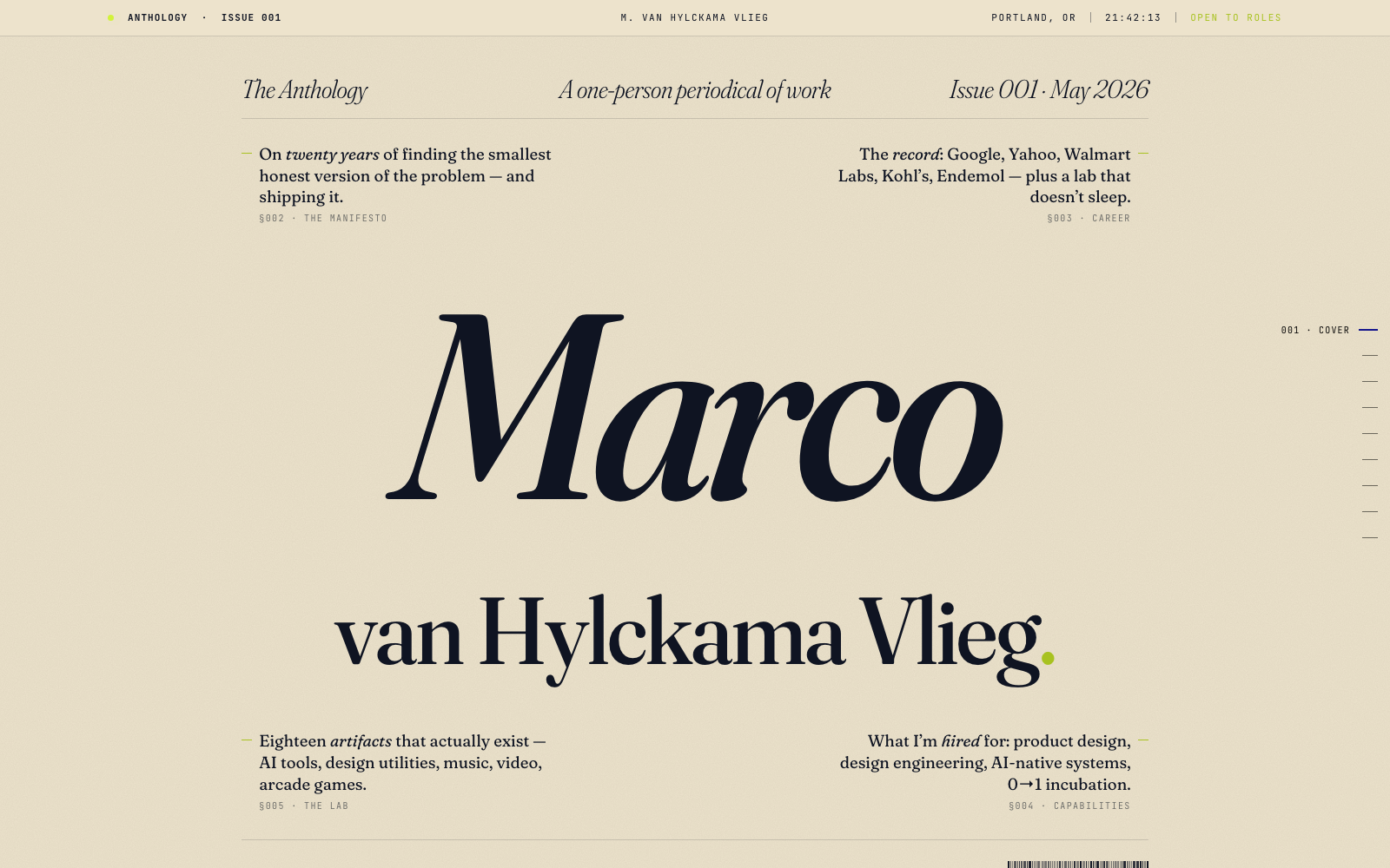
The Anthology.
A printed periodical of work. Magazine cover, running heads, colophon, variable-font reactive typography.
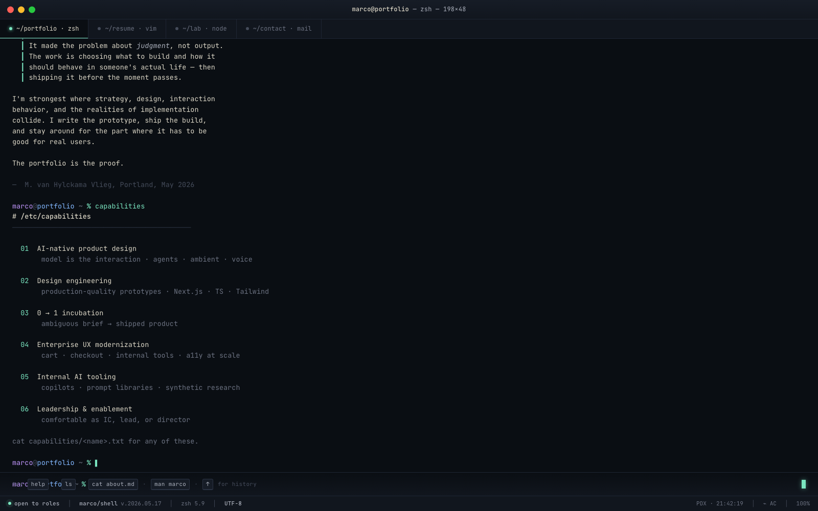
Marco/Shell.
A real interactive terminal. Type help, ls, cat about.md, man marco, sudo hire-me.
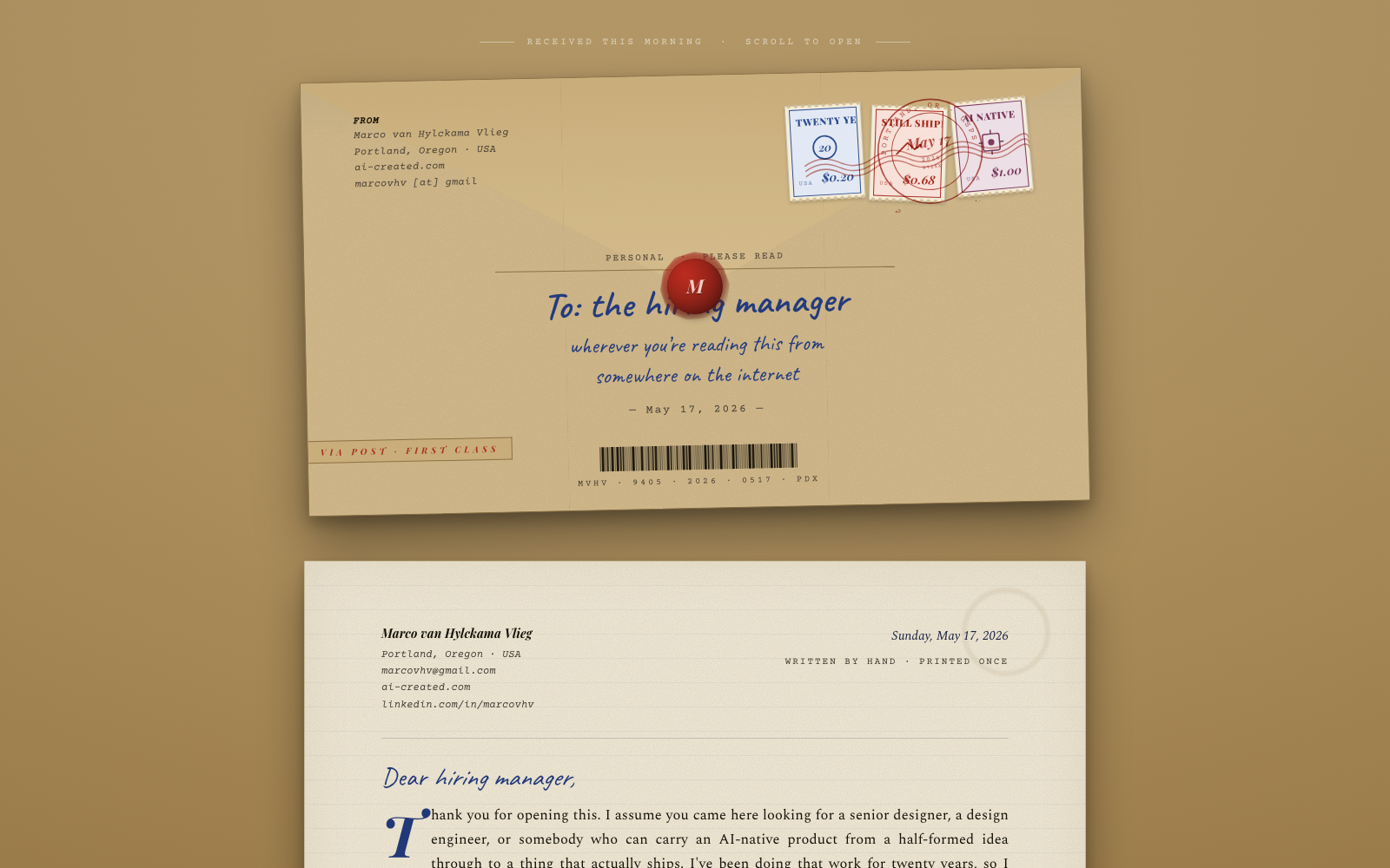
A letter from Marco.
A piece of physical mail. Envelope with SVG stamps, wax seal, postmark, polaroids, contact sheet, index card.
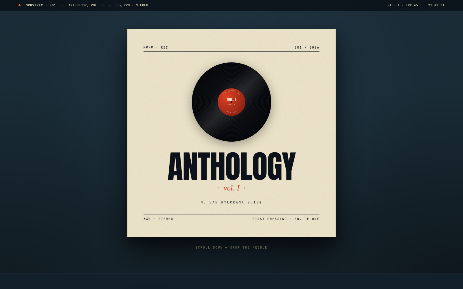
Anthology, Vol. I.
A vinyl record. Cover, spinning disc with tonearm tracking, Side A career, Side B lab, liner notes, label closeup.
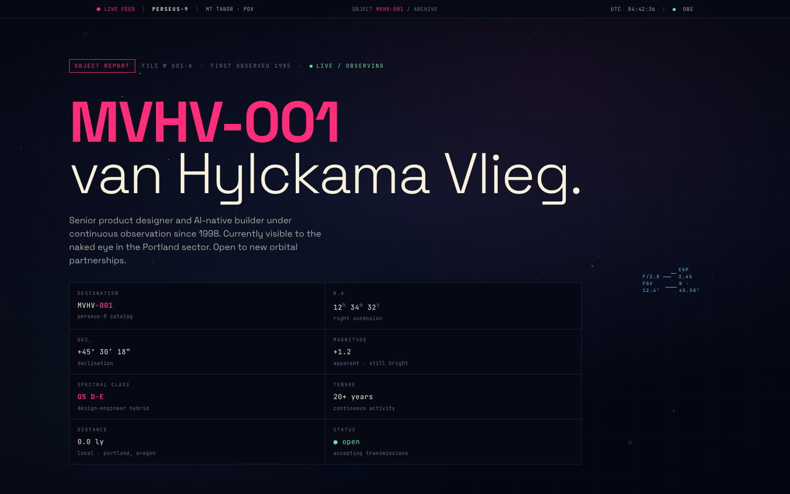
Object MVHV-001.
An astronomical observation. Telescope view, career as a constellation, spectroscopic capabilities, orbital lab bodies.
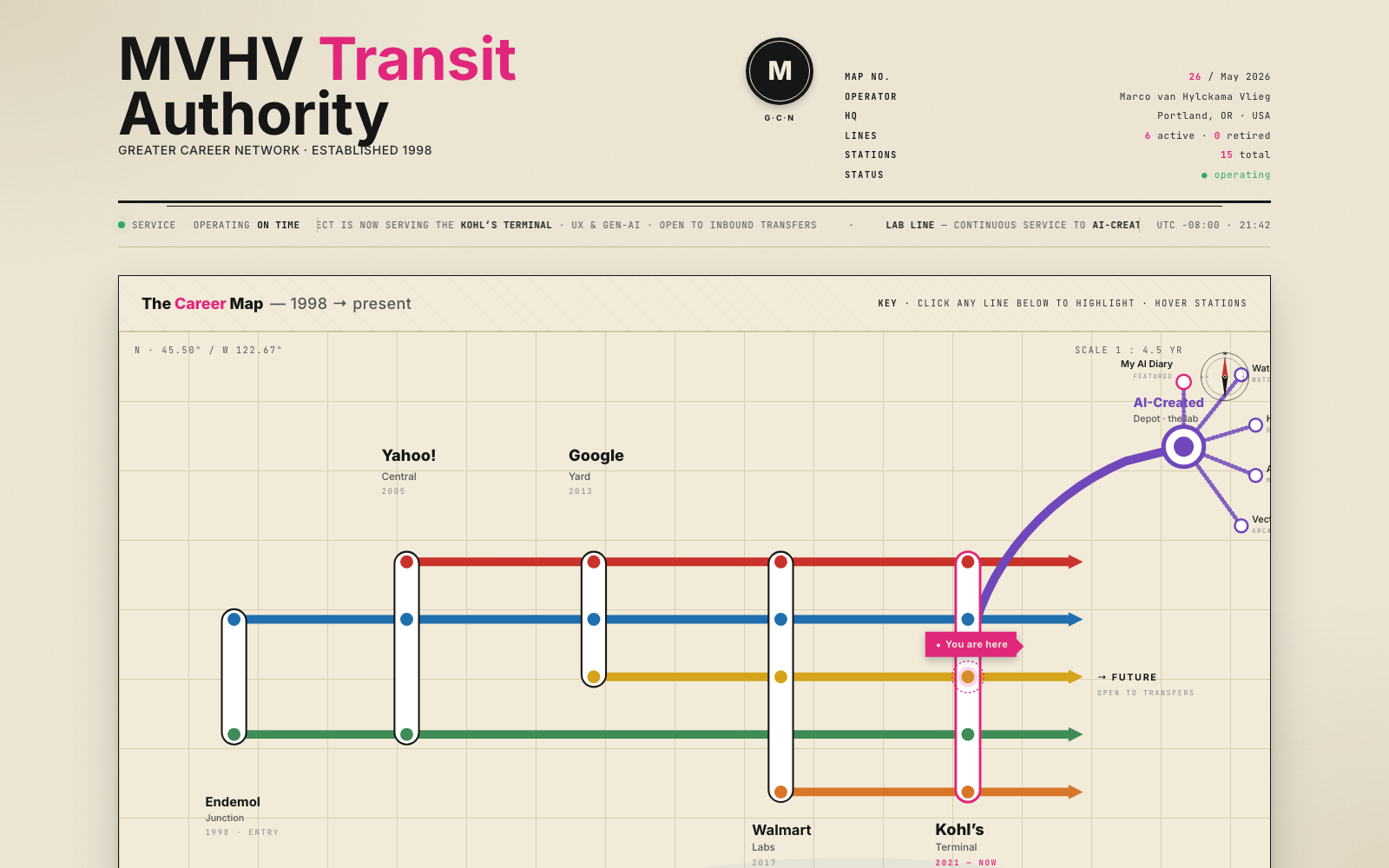
MVHV Transit.
A Vignelli/Beck transit map. Six colored lines, fifteen stations, project termini, line filtering, station tooltips.
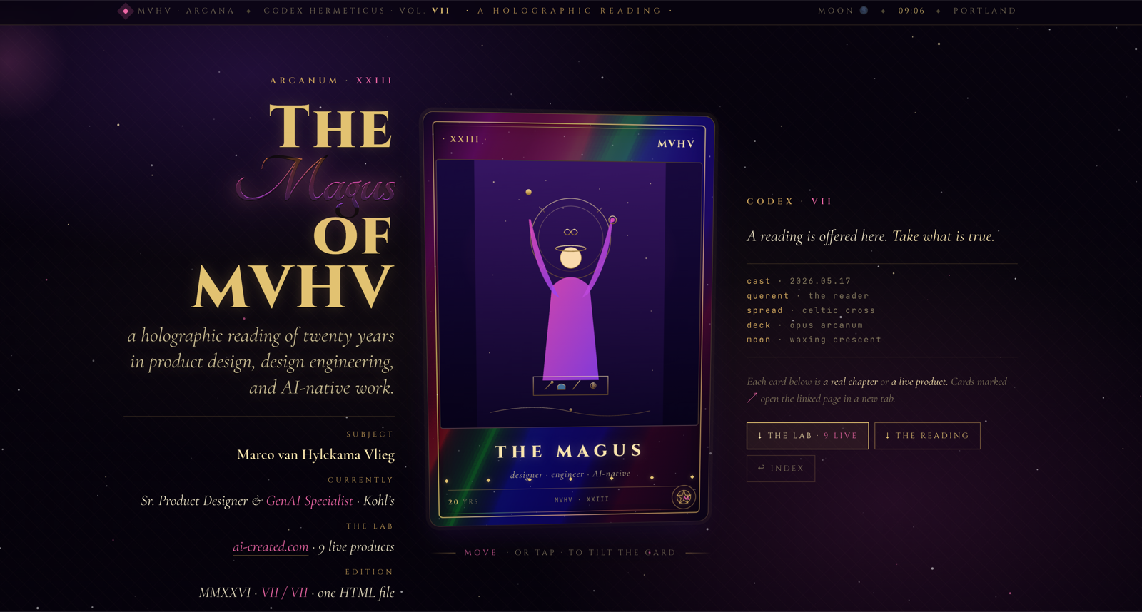
MVHV Arcana.
A holographic tarot reading. Mouse‑tracked rainbow foil on the hero card, a 10‑card spread that is a CV, flip-to-read interpretations, real product links.
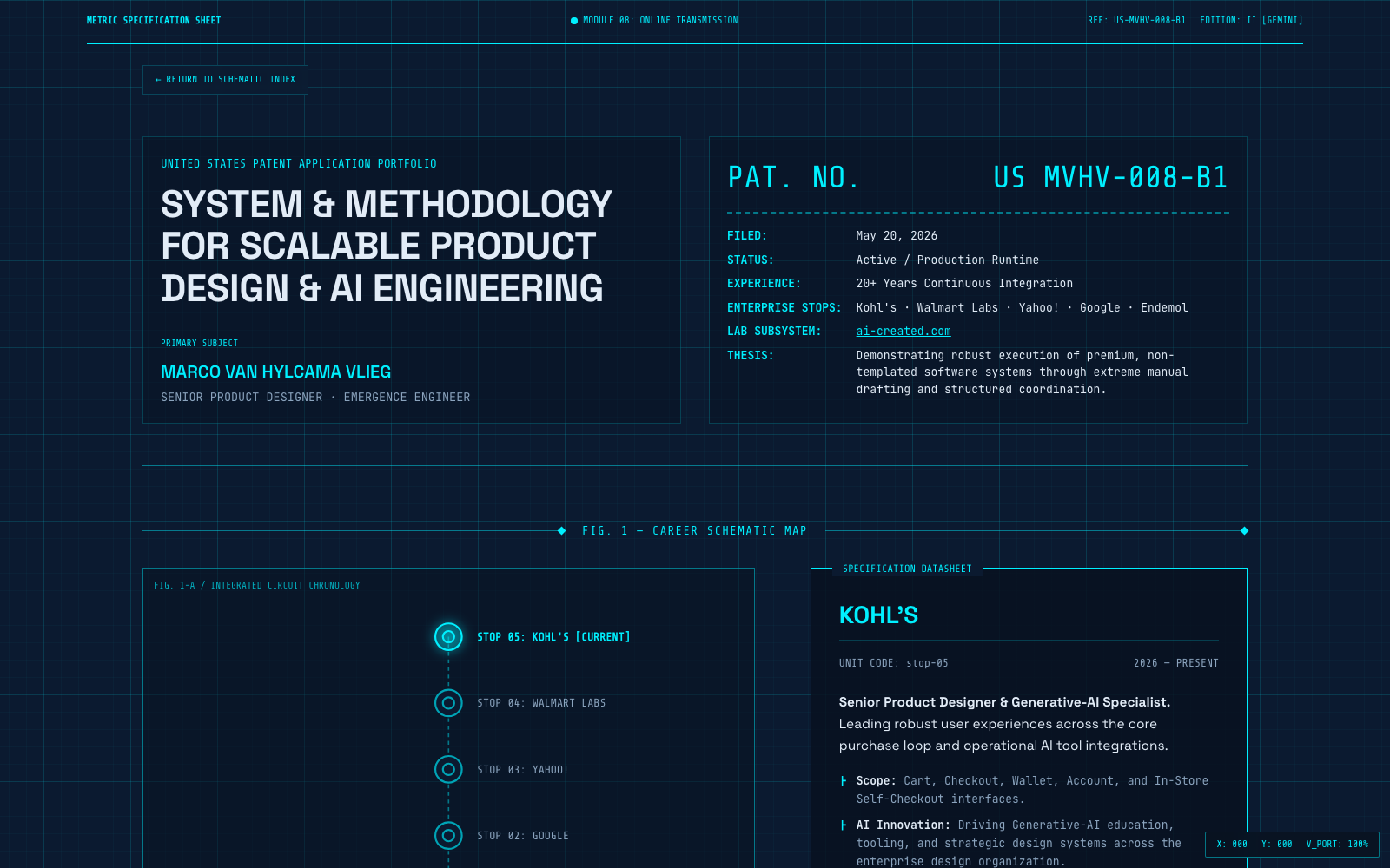
The Blueprint.
A technical patent schematic. Neon cyan coordinate grids, interactive drawing nodes, and precise structural engineering spec cards.
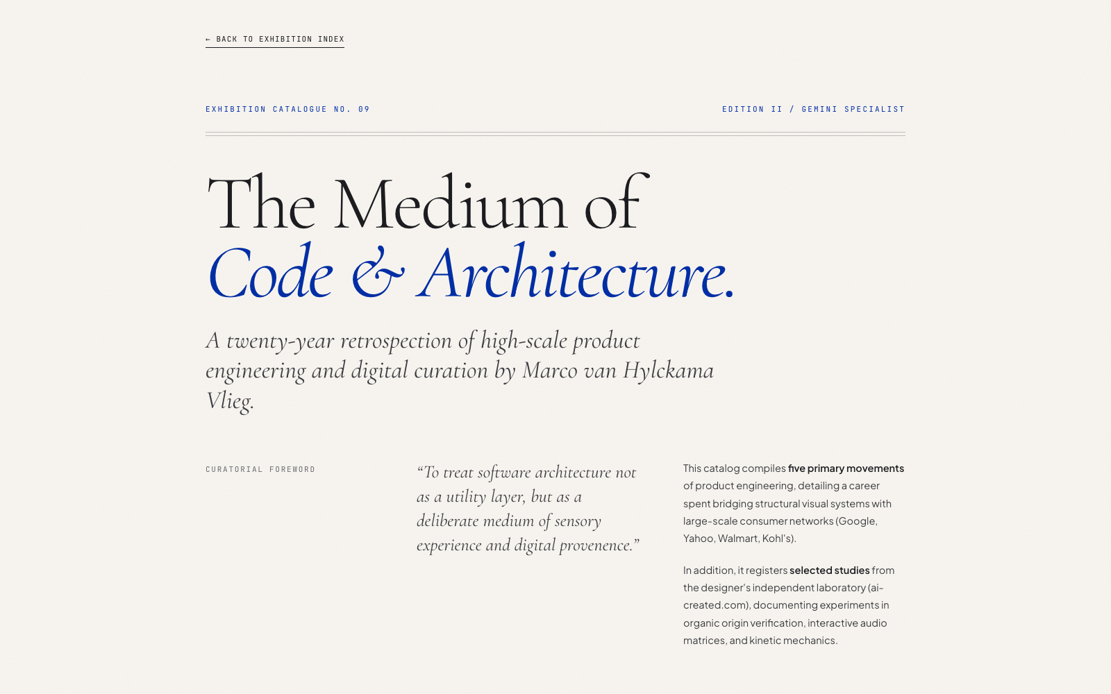
The Curator.
A minimalist luxury exhibition catalog. Asymmetrical margin grids, curatorial annotation logs, and spacious editorial layout.
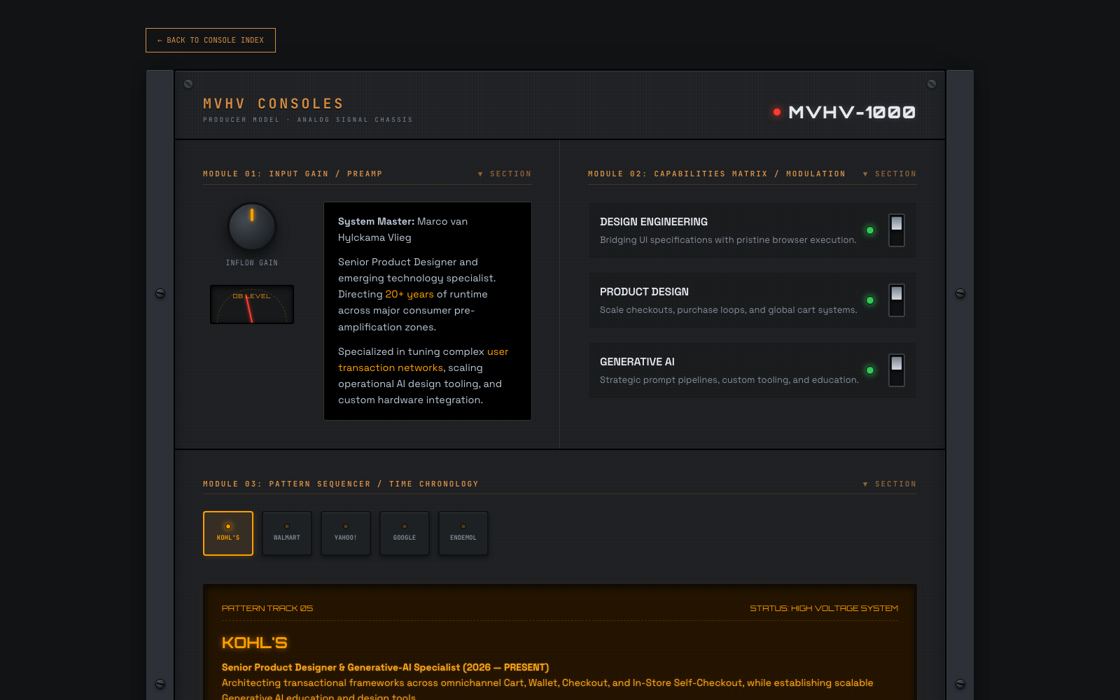
The Console.
A vintage analog synthesizer rack. Draggable metal knobs, glowing state LEDs, bouncing VU meters, and custom Web Audio physical click sound synthesis.
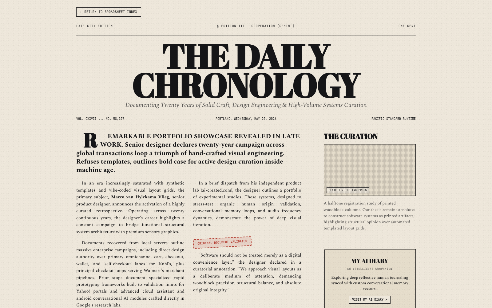
The Chronology.
A mid-century printed broadsheet newspaper. Heavy black ink columns, retro stamped layouts, and an interactive tracking glass magnifying lens.
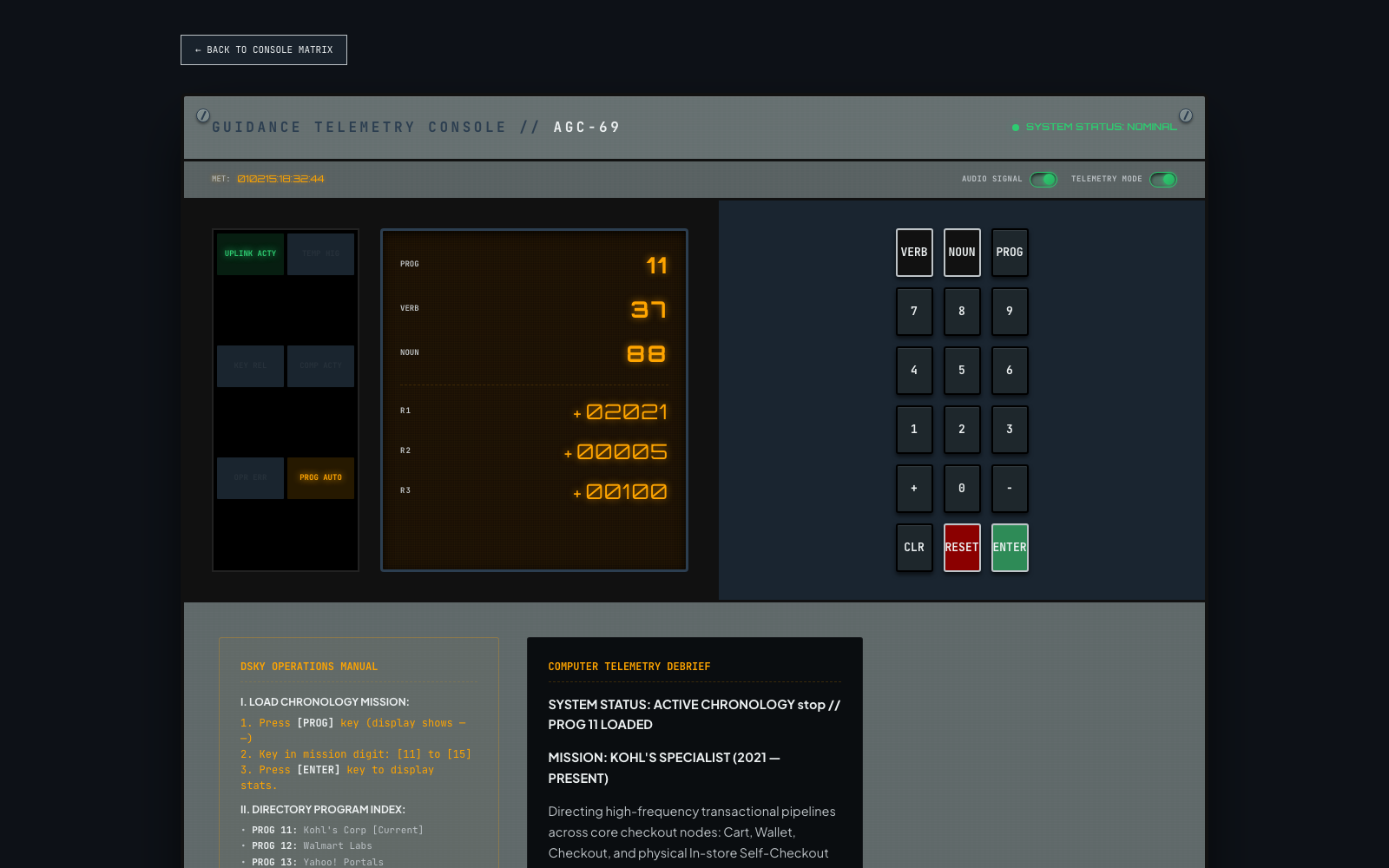
The Telemetry.
A 1969 Apollo Guidance Computer (DSKY) dashboard. 7-segment digital screens, a warning indicator grid, an active radar scope, and synthesized Quindar beep tones.
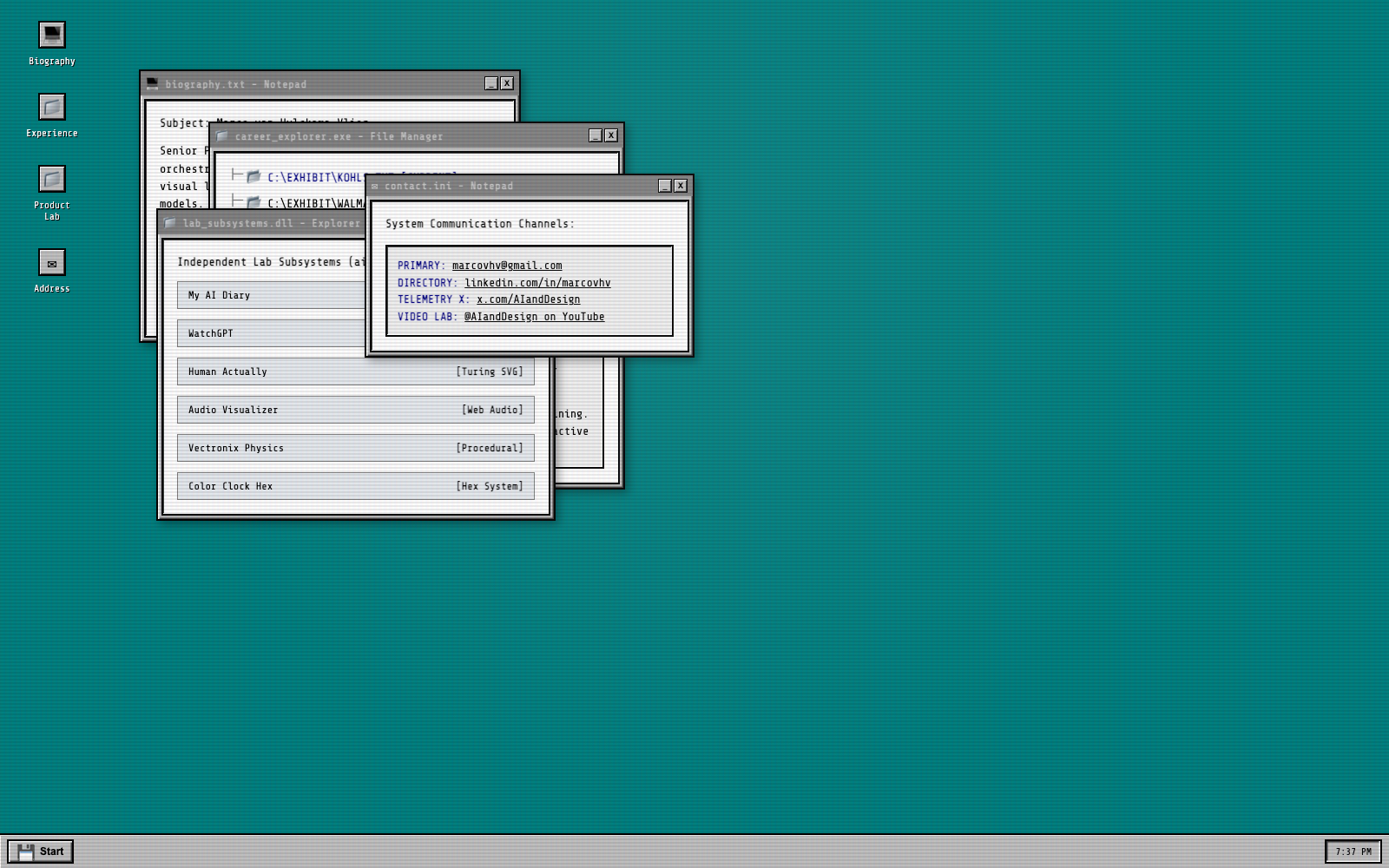
System 95.
A nostalgic 16-bit draggable GUI desktop. Pixel shortcut icons, a taskbar Start menu, draggable folders and text pads, and synthesized retro chiptune chimes.
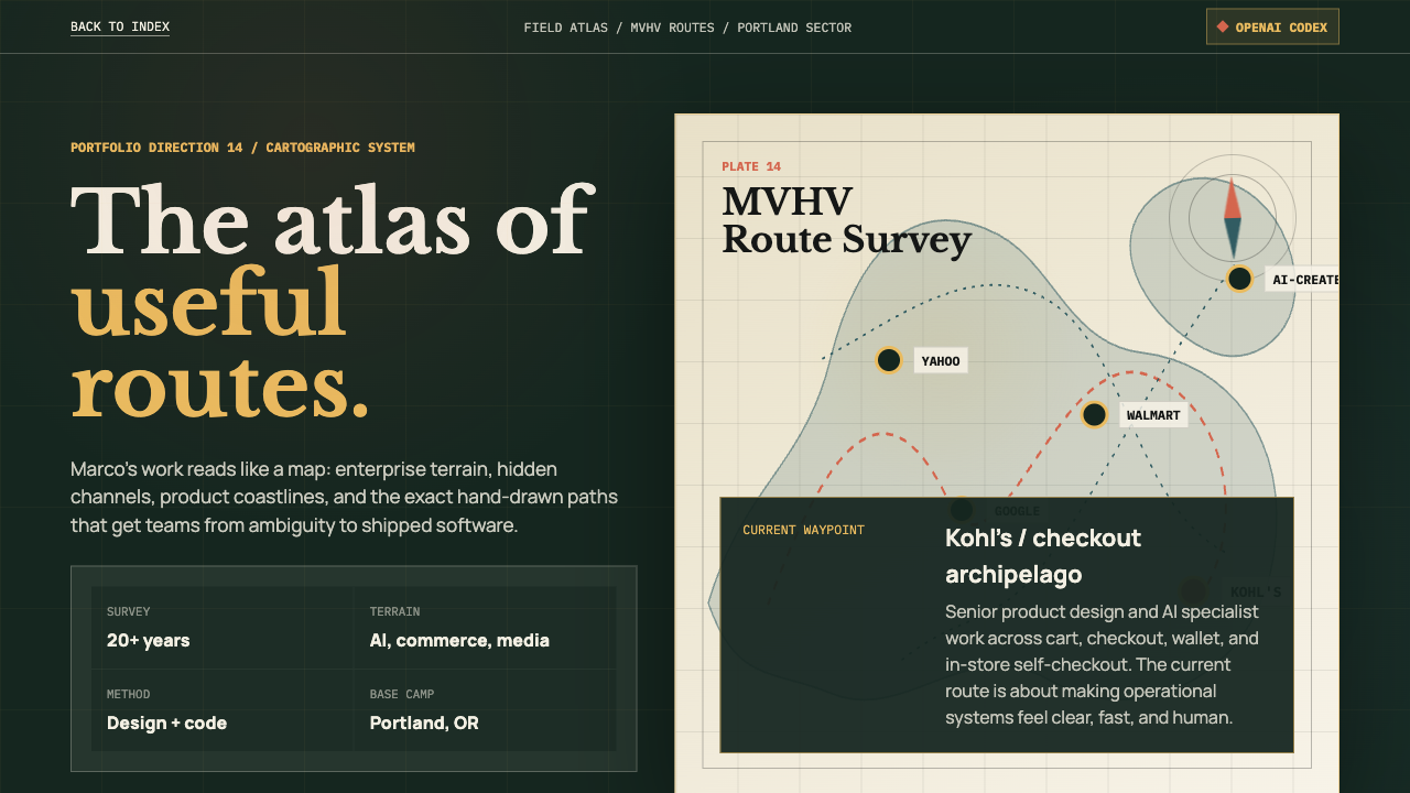
The Atlas.
A cartographic expedition map. Compass, animated trade routes, clickable waypoints, logbook notes, and lab islands plotted as signal fires.
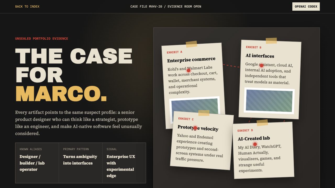
Case File MVHV-20.
A noir evidence room. Red thread, pinned exhibits, flashlight glow, dossier cards, and hover-to-reveal redacted motive notes.
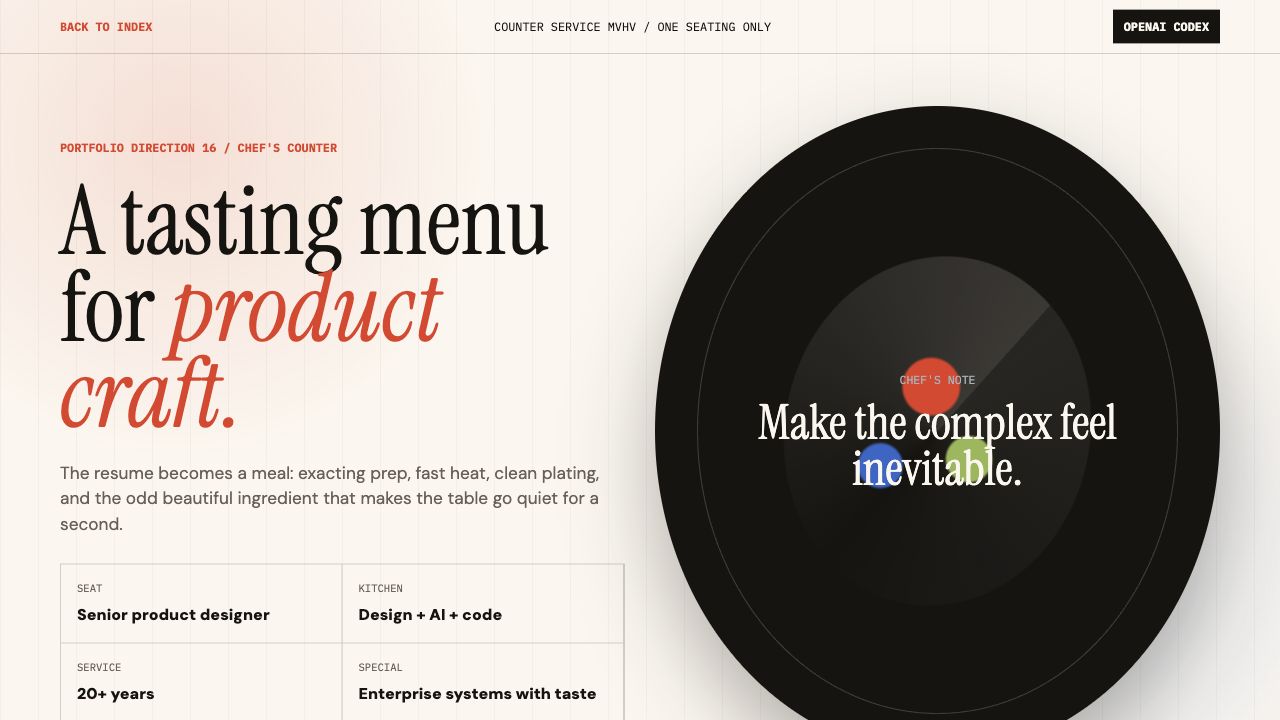
Counter Service.
A chef's counter portfolio. Rotating plate composition, service tickets, four product courses, and a menu for turning ambiguity into craft.
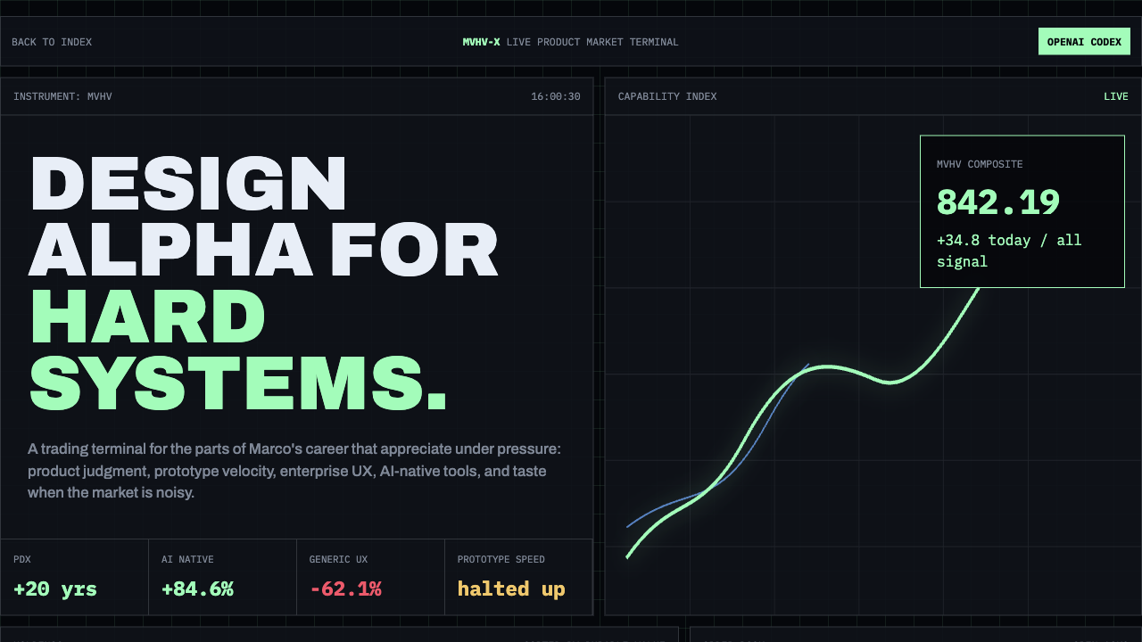
MVHV Exchange.
A live market terminal. Capability index charts, tickers, holdings, order book, and a dense trading-floor read on product value.
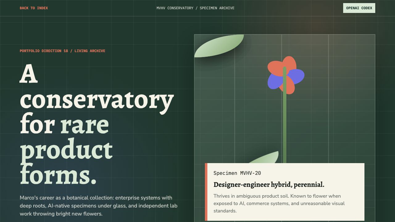
The Conservatory.
A living herbarium. Glasshouse specimen case, growth rings, botanical drawers, and AI lab cuttings propagated into useful tools.
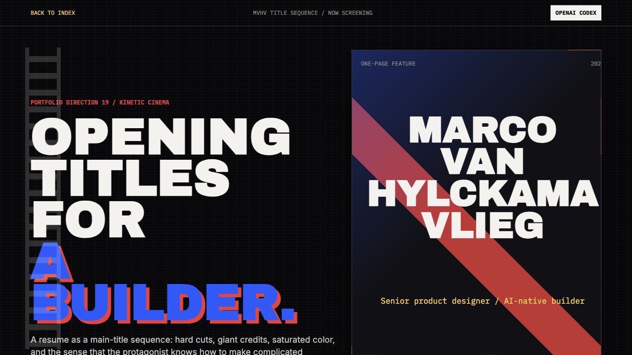
Opening Titles.
A kinetic cinema title sequence. Filmstrip motion, marquee credits, saturated poster typography, scene cards, and skills above title.
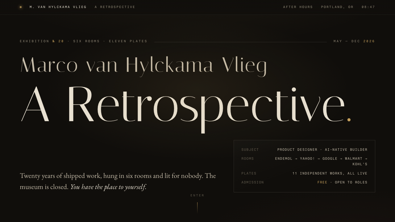
Nocturne.
A retrospective seen after hours. Six rooms of career, eleven framed plates with engraved-line artwork, a cursor-tracked spotlight, and an oxblood room of capabilities.
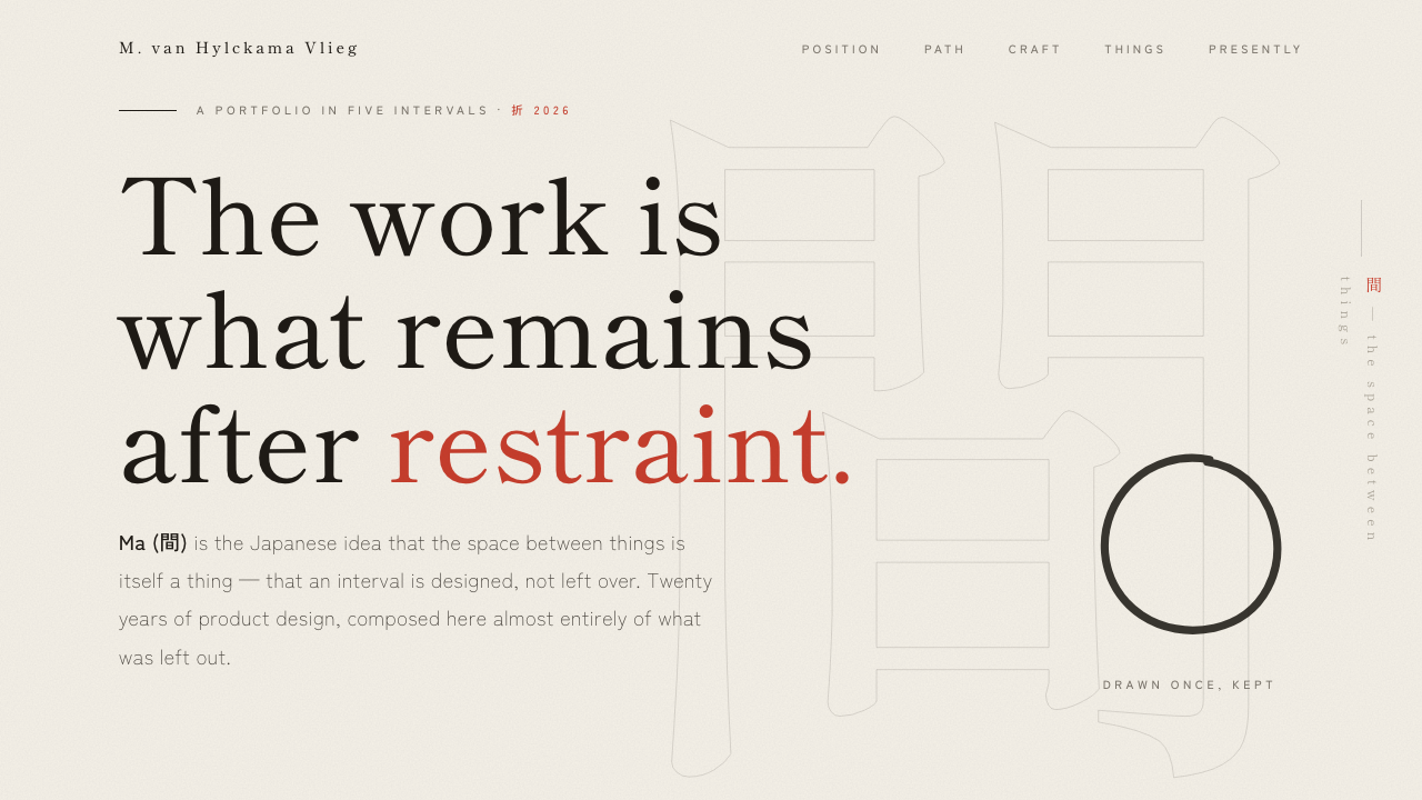
間 — The Interval.
Ma — the space between things. Washi paper, sumi ink, one vermillion seal, an ensō drawn on arrival, and a career told in five quiet intervals of restraint.
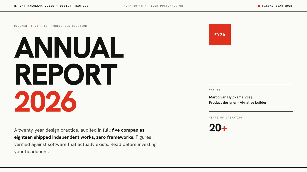
Annual Report.
A twenty-year practice audited in the Swiss International Style. Letter to shareholders, fiscal years with gantt spans, business segments, and a holdings table — every position live.
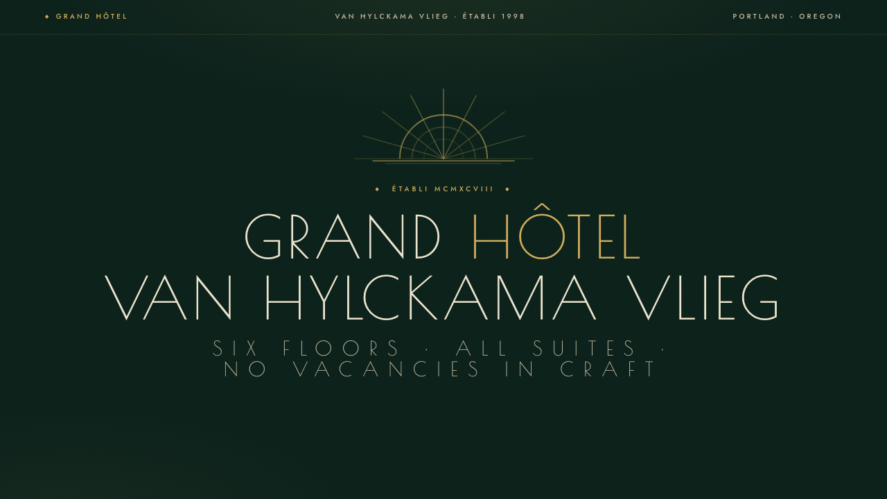
Grand Hôtel.
An art deco house, est. 1998. Gold sunburst marquee, the career as an elevator floor directory, capabilities as amenities, the lab as a room-service carte du jour, and a concierge bell.
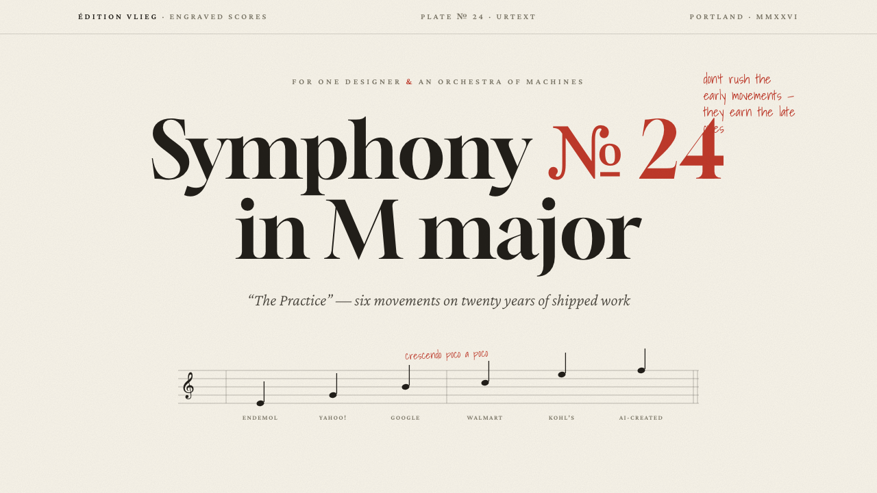
Symphony № 24.
A career engraved as sheet music. Six movements with tempo markings, capabilities as dynamics (ff → tutti), the lab as a repertoire of opus numbers, and the conductor's red pencil in the margins.